Burgerism
A rebrand that gave great burgers more character
The old brand was bright orange with greys, and stark black and white. It felt cold. It didn’t feel like food.
The idea
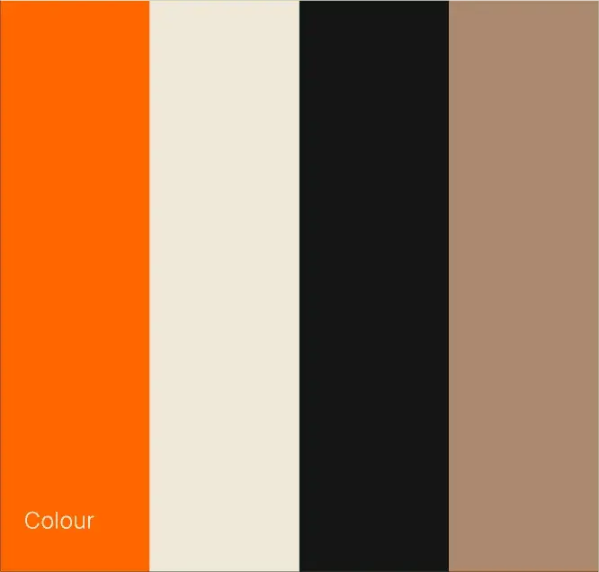
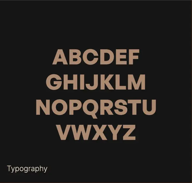
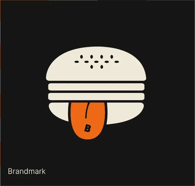
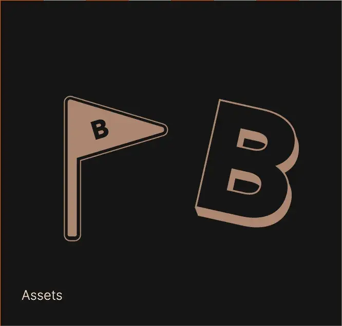
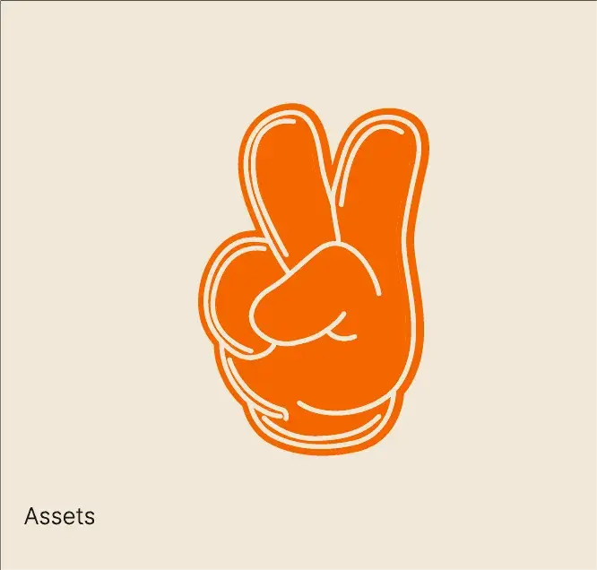
Keep the orange. Lose the greys. Warm everything else up. Off-white, off-black and a kraft brown. One typeface, General Sans, which looks more edible and more premium. New assets with attitude: a peace hand, a flag, an explosion.
What we made
The brand refresh. Menu posters for each site, burger boxes, a Christmas paper bag, stickers, billboards, Instagram, a lip-licking animation and the website.